






Golf fashion portrait of a man wearing a green cap and Students Golf shirt
A culture-led visual direction makes Brekky’s proposition feel at home in modern golf.
Complete Brekky homepage from the opening media hub through positioning, services, portfolio, team and footer
Complete homepage — a continuous journey connects Brekky’s positioning, services, portfolio and people, giving visitors a clearer understanding of the business.
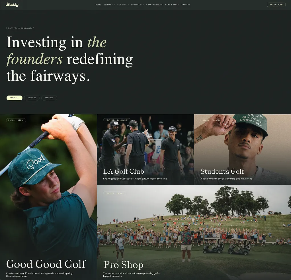
Brekky portfolio page design with Good Good Golf, LA Golf Club, Students Golf, and Pro Shop project cards
Portfolio page design — photography and company context make the breadth of Brekky’s involvement easier for founders and partners to understand.
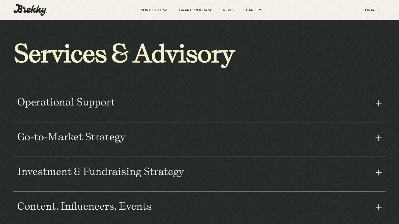
Brekky Services and Advisory section with expandable service categories
Progressive disclosure keeps the proposition concise while letting serious prospects explore the support relevant to them.
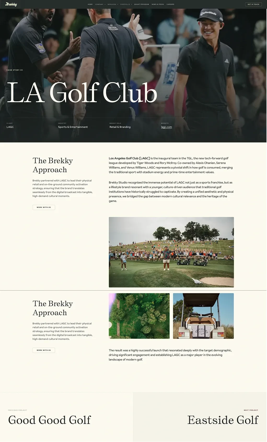
Brekky portfolio detail page design for Los Angeles Golf Club
Portfolio detail design — a reusable story format connects each company, its context, and Brekky’s role as the portfolio grows.
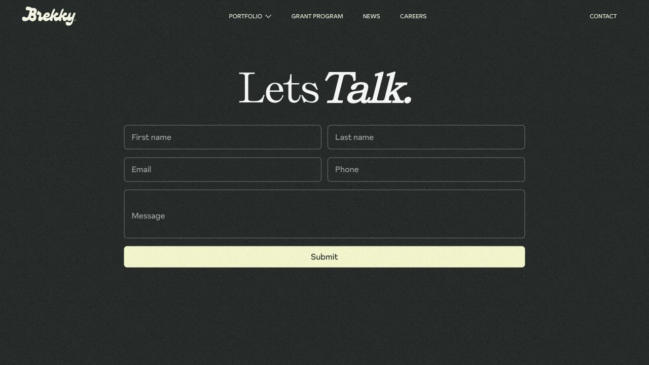
Brekky dedicated contact page with a simple inquiry form
A dedicated inquiry page gives interested founders and collaborators an obvious route from exploration to conversation.

BREKKY REFRESH

Client
Brekky Golf Co.
Case study
BREKKY REFRESH
Deliverables
Website Strategy / UI/UX / Web Development / Motion Design / Content Architecture

Challenge

Brekky Golf Co. had a growing portfolio, a hands-on role in building golf businesses, and a story that needed to be clearer online. The refresh needed to show what Brekky was working on, how it supported each company, and why the right founders and partners should want to be involved.

The brief called for stronger visual proof, more concise positioning, and a home for the brand’s expanding editorial presence, while preserving the character and taste of its existing identity.

Solution

We restructured the experience around discovery. A media-led homepage brings the portfolio, grant program, and newsletter into the opening view. Visual company cards and a reusable portfolio detail format make the work easier to explore, connecting each business to the context of Brekky’s involvement.

The content hierarchy leads with the operator perspective, then unfolds into services, companies, and people. Expandable service sections offer depth without crowding the page, while distinct routes for the portfolio, grant program, careers, and contact give different audiences a clearer path.

Intentional reveals and fluid transitions carry the brand’s confidence through the experience. Motion guides attention and gives the photography room to land; it supports the story rather than competing with it. The visual system keeps Brekky’s cultural character while giving its commercial proposition more structure.

Impact

The redesign gives Brekky a more coherent platform for presenting its work and starting partnership conversations. Prospective founders can see the breadth of the portfolio, understand the studio’s role, and move from interest to a direct inquiry.

The result is a website that supports both credibility today and new stories tomorrow: a clearer positioning narrative, a visible editorial entry point, and a repeatable framework for showcasing companies as the business evolves.